Mägi Airlines
BRAND IDENTITY
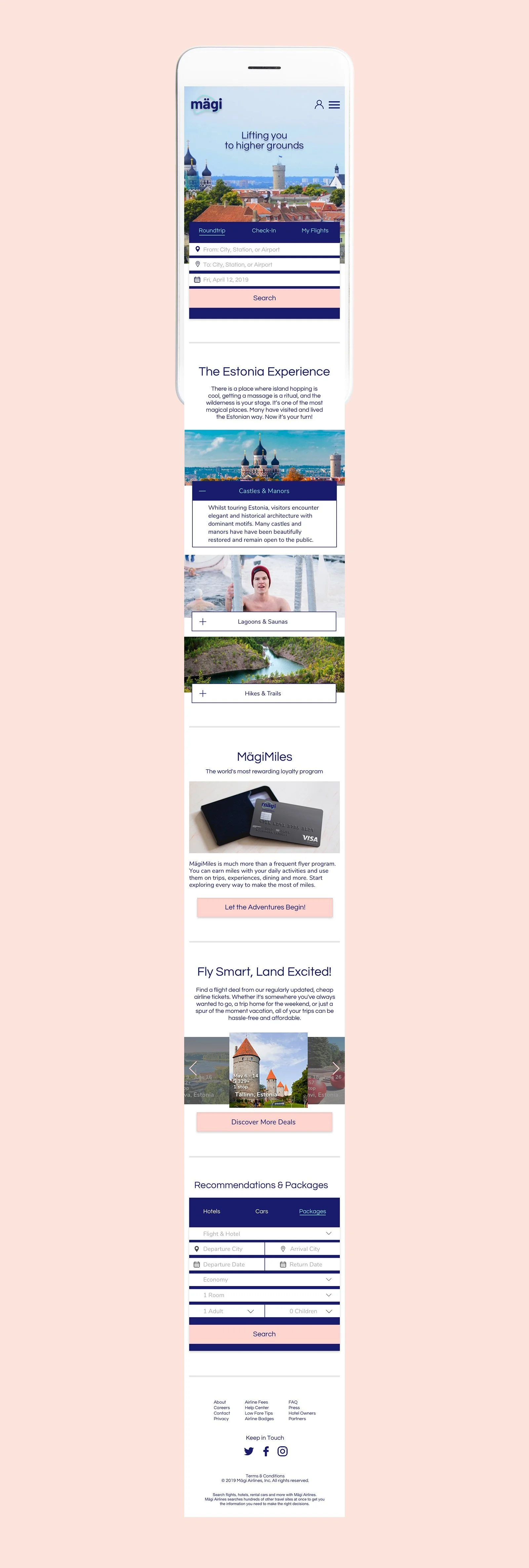
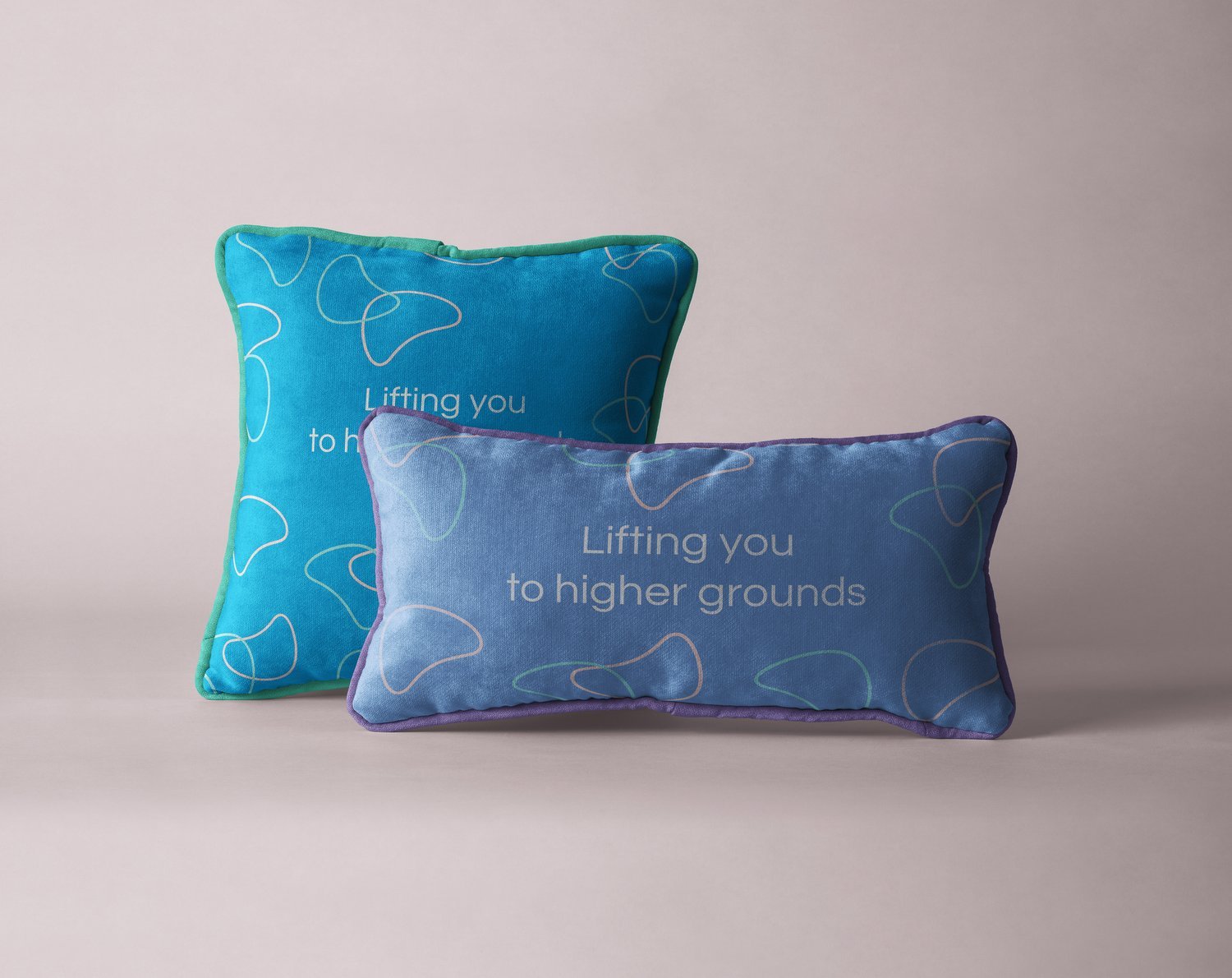
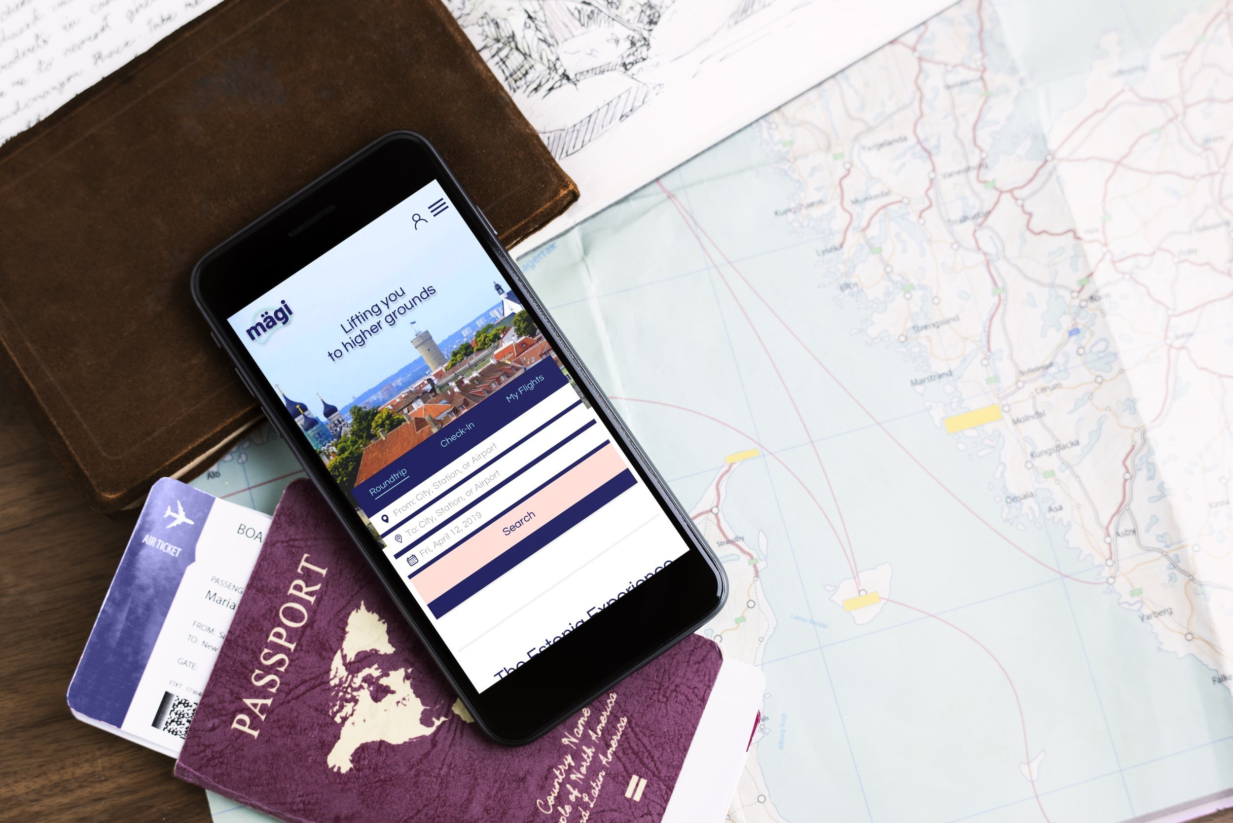
I crafted a strategic and visually cohesive brand identity for an Estonian airline named Mägi—a word meaning “mountain” or “hill” in Estonian. I drew inspiration from the natural elevation implied by the name, the core concept “Lifting You to Higher Grounds” served as the foundation for the visual and verbal language of the brand.
The identity reflects themes of ascent, clarity, and trust—essential qualities in the aviation industry—through refined typography, an uplifting color palette, and minimalist graphic elements that echo the contours of mountain landscapes. The brand system was designed to be both timeless and flexible, adaptable across digital and print.
Student work at Shillington School of Graphic Design